One of the more commonly cited reasons to hold onto vinyl — and for institutions to archive same — is to preserve the artwork, which often didn’t make the transition to CDs (where in any case it would have been shrunk to a fraction of its original 12 X 12-inch size). We all have countless examples of cover illustrations we love. There were, however, quite a few hideous-looking sleeves too.
Some of the tackiest seemed reserved for vinyl reissue compilations, at a time when reissues were generally packaged with less care and passion than they are now. Not that there isn’t some loathsome artwork on CD reissues, but generally they show more understanding of the musical catalogs they’re exploiting. This post will take a look back at some of the more amusing testaments to vinyl ugliness.
Everybody has their personal favorite, if that’s the right word, in this category. It would take quite some doing, however, to beat this rather obscure 1976 German double-LP Velvet Underground compilation for both frighteningly awful design and a total failure to represent the music of the artist:
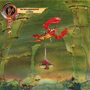
It’s like a bad satire of Roger Dean, the guy who designed all those fantasy-laden Yes covers. Is that a lobster expelling a spaceship? If this is meant to represent the “Underground” in Velvet Underground, isn’t it a little more like a science fiction cartoon than the street life Lou Reed took such relish in documenting?
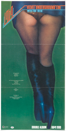
Of course, some VU fans might vote for this far better known 1974 double LP, though at least that contained great music that hadn’t previously seen the light of day:
Whether it was haste, cheapness, or both, a good number of British Invasion reissues suffered from literal representations of band names. Let’s start at the beginning of the alphabet, with the Animals:
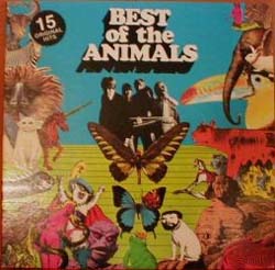
The liner notes and track sequencing were no great shakes either. But if you were looking for a “starter” Animals comp in the late 1970s, as I was in high school, it was the only game in town — despite the absence of numerous essential tracks, some of which had even been big hits, like “Inside Looking Out.”
The Animals compilation was issued by Allen Klein’s company, ABKCO, which outdid even this low standard with its most infamous, yet probably most commercially successful, release:
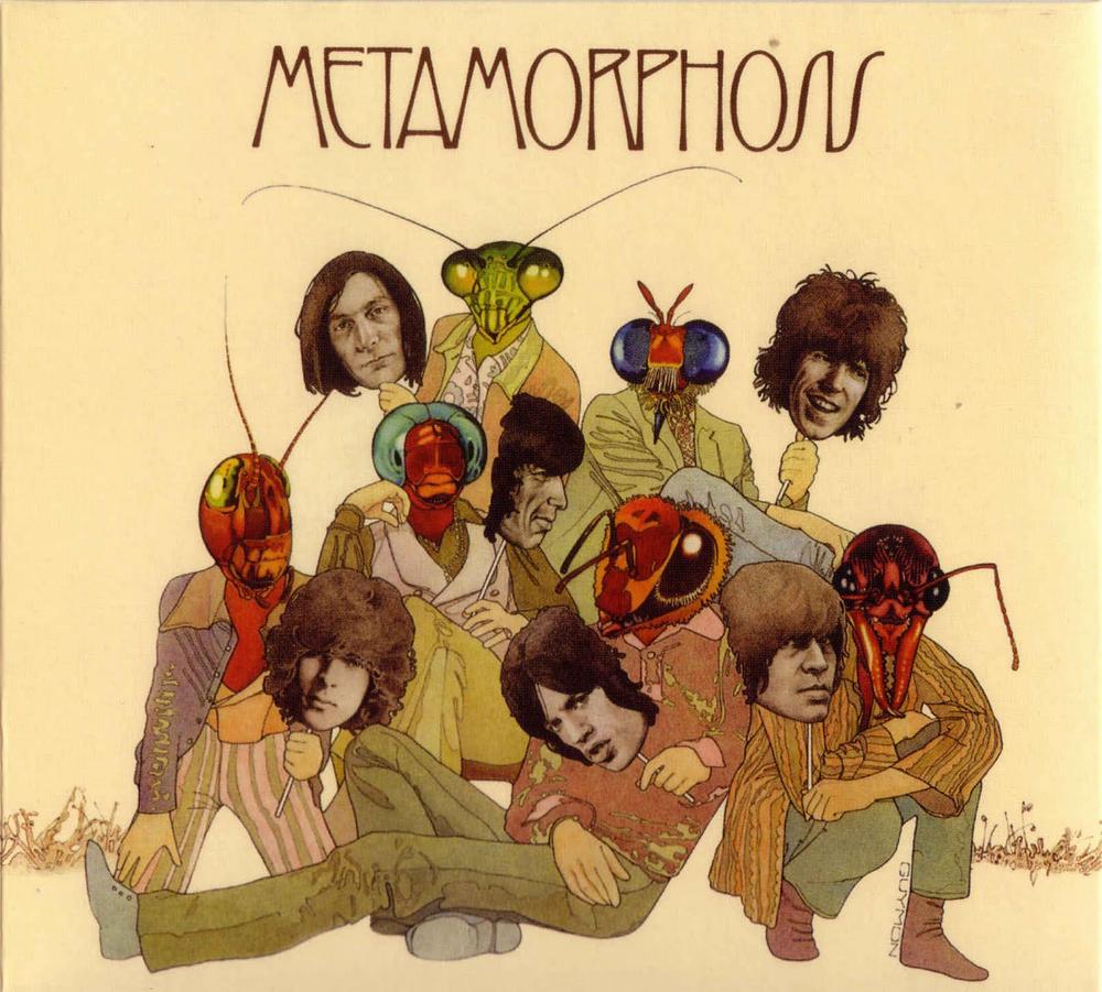
As I wrote in a previous post, it’s almost as if they were trying to scare listeners away. If so, they weren’t wholly successful, the album making #8 in the US charts despite being a critically panned collection of motley outtakes. I suppose that means it wasn’t technically a “reissue,” but it’s close enough, especially considering most of it was about five to ten years old when it came out in 1975.
True, the bugs that share center stage with the Stones on the cover could be explained as a literal representation of the title, since Franz Kafka’s classic short story Metamorphosis documents a man’s transformation into a huge, monstrous insect. Some might even suspect this was Allen Klein’s way at getting back at his former clients, arranging to package outtakes they didn’t want released in the most unappealing manner possible. For a guy with such an avaricious reputation, however, wouldn’t that have been rather uncharacteristic self-sabotage?
And here’s another “let’s represent the title literally” on the back cover of this far more obscure release by the Stones’ biggest rivals, the Beatles, this time without a trace of irony:
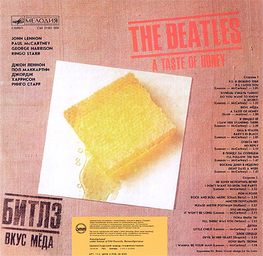
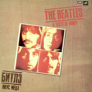
The idea being, on this Russian compilation, to put the title — “A Taste of Honey,” a cover tune from their debut LP that was one of the Beatles’ least celebrated tracks — into a picture as well as words. I would never have come across this particular unlovely relic had not someone given it to me about 25 years ago. An utterly random collection of 1962-64 tracks, its absurdity was capped by a front cover design featuring images from the giveaway photos in The White Album, which of course didn’t come out until 1968.
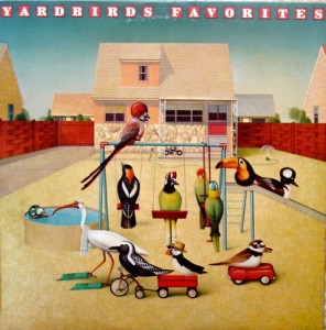
The Yardbirds suffered most from LP designers taking their name literally. Epic Records issued no less than three Yardbirds albums depicting actual Yardbirds:
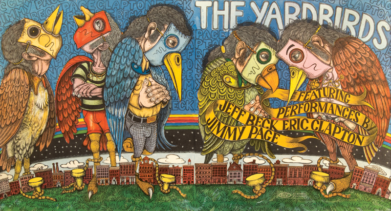
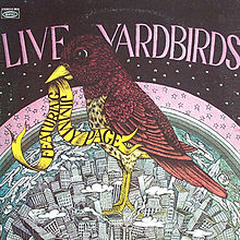
One of these, Live Yardbirds Featuring Jimmy Page, is not exactly in common circulation. A none-too-great recording of the band at New York’s Anderson Theatre on March 30, 1968 (complete with dubbed-on bullfighting crowd noise), it was quickly withdrawn after its September 1971 release when Page threatened legal action. It’s been heavily bootlegged since then, however, ironically sometimes with the same uninspired artwork as graced the original.
Epic Records also foisted this compilation of another great British Invasion band on the public:
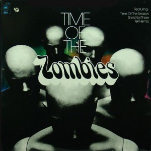
What better way to advertise a band specializing in superb, moodily melodic minor-keyed rock than a drawing of actual zombies, the kind you’d see on a B-movie poster? The track selection on this double-LP compilation was none too stellar either, combining their 1968 album Odessey and Oracle with a slapdash LP side of mid-‘60s tracks (making sure to include the hits “She’s Not There” and “Tell Her No”) and an LP side of leftovers/outtakes. But again, like the Animals best-of, it was the only game in town if you wanted relatively obtainable Zombies in bulk in the late ‘70s. We would not have counted on a multi-disc Zombies box set back then, along with other comps mopping up every released recording and many BBC recordings and outtakes, as eventually came to pass in the CD era.
Until then, you had to scrounge for some of the non-hit singles and B-sides on scrappy anthologies like these, which wouldn’t have won any prizes for imagination either:
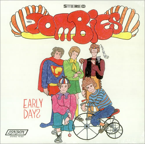
The front cover illustration bears only casual likeness to the actual guys in the Zombies. Which wouldn’t have bothered the listener who’d never seen them, except the label made sure to stick an actual photo of the band on the back.
The literal representation thing got a little out of hand with these wildly different sleeves on the same record. Here’s the first version:
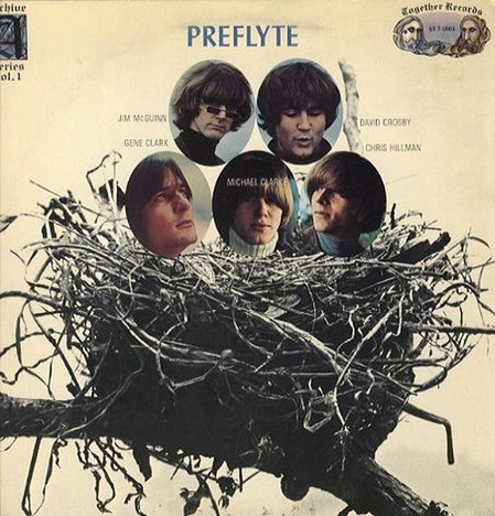
Again, technically speaking, Preflyte wasn’t a reissue, but a collection of archive recordings. And a very good one, of early demos that were about five years old when they came out in 1969. The idea on the original was to put the Byrds in a nest — pretty corny, but at least they used photos of the five guys from the group’s early days. Then the same tracks came out again, with the same title, but a much different sleeve:
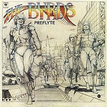
The idea here was to portray the Byrds as astronauts, the ultimate manifestation of the “flight” they were ready to take once they left the nest. And true, some of their songs did branch into space travel — “Mr. Spaceman,” “Fifth Dimension,” “Eight Miles High,” “2-4-2 Fox Trot (The Lear Jet Song),” “C.T.A. 102,” and “Space Odyssey” being only the most obvious — though most of those weren’t recorded until two or three years after the demos on Preflyte. And Preflyte does include “The Airport Song,” one of their lovelier earliest efforts. But while the cover illustrations very closely resembled their real-life images, the ultimate effect was to make them look rather like extras in The Jetsons. (When this post went up, a reader informed me this illustration was the work of a young Barry Smith, who had recently finished a stretch working on Marvel’s Conan comic book.)
Literalism took another turn on this double LP of early David Bowie tracks, issued in 1973 right after he finally started to crack the US market. Taking advantage of the early Bowie’s propensity for descriptive song titles with very specific nouns and characters, a la “Karma Man,” “Rubber Band,” “Please Mr. Gravedigger,” and “Silly Boy Blue,” each of the 21 tracks were illustrated with garish cartoons:
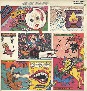
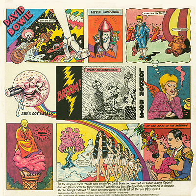
It was too loud and crass for some Bowie fans, but I have to admit I kind of like it. And marketing-wise, it might have been both more effective than a vintage photo of Bowie in 1966 and 1967 (which would have looked totally unlike his 1973 image) and less misleading than an early-‘70s photo of the man (which might have left the mistaken impression that it was a collection of recent recordings). And while it’s been superseded by a much, much more comprehensive collection of his pre-Space Oddity recordings for Deram (now on an expanded two-CD edition of his 1967 David Bowie LP), back in the ‘70s it was the lengthiest survey of that era available, including his best recording of the time, the late-1966 non-LP B-side “The London Boys.”
Then we had some compilations that not only weren’t much to look at, but seemed to have no relation to either the band or the contents. The first album discussed in this post, the German The Velvet Underground Featuring Lou Reed, falls into this category. So does this less blatantly surreal cover for a much more well known (though not exactly famous) LP, The Great Lost Kinks Album:
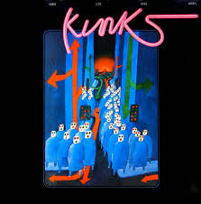
As to what all those dice-head figures and semi-traffic signals are meant to represent, you really got me (haw haw). Again, one almost suspects the Reprise label was deliberately not trying to sell records, although this mixture of rarities and outtakes is actually quite good. The sense of self-sabotage was amplified by John Mendelsohn’s infamous liner notes, which trashed the Kinks’ then-recent (at the time of this January 1973 release) output — which just happened to have been released not on Reprise, but the label the band jumped to, RCA. At least there’s a picture of Ray Davies on the back cover, but the head Kink was not amused, pressuring the label to withdraw it from circulation by the mid-‘70s.
There are too many rather unappetizing, yet rather boring, reissue designs to mention in a relatively brief survey like this, a la the one for Jefferson Airplane’s generally worthy 1974 outtake/rarity compilation Early Flight:
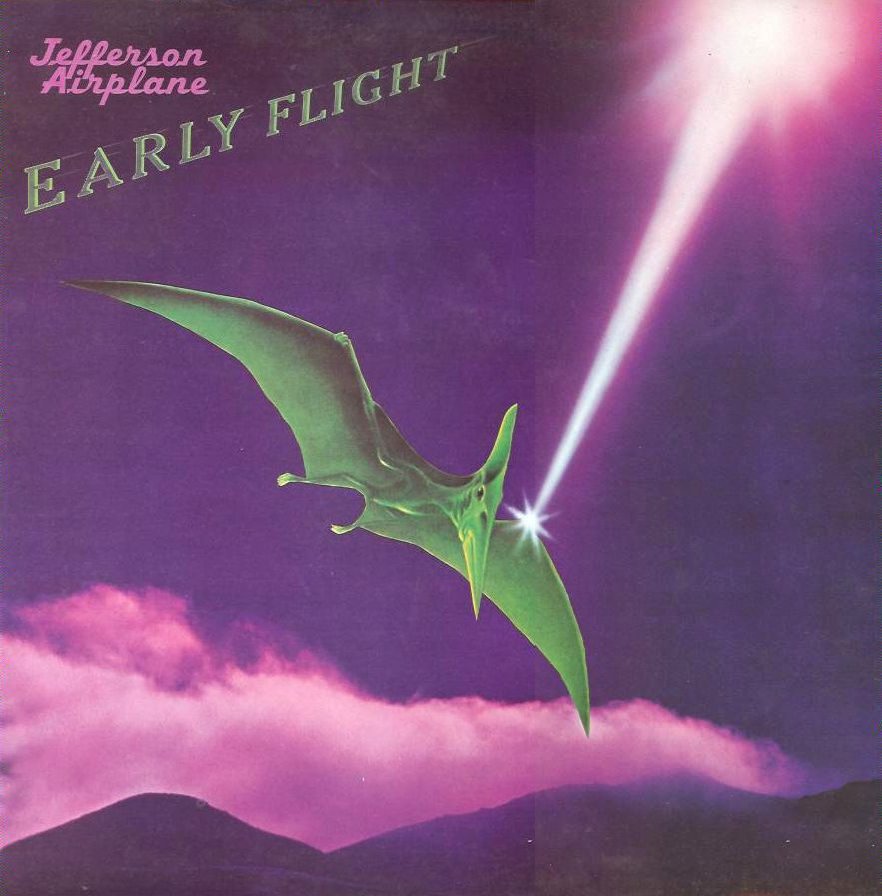
Even an actual drawing of an airplane would have been better than this. Jefferson Airplane as a pterodactyl?
We also had this reissue — although the reissue itself had first appeared just four years earlier! — of one of the most famous reissues of all time, the garage rock compilation Nuggets, first released on Elektra in 1972 in this sleeve:
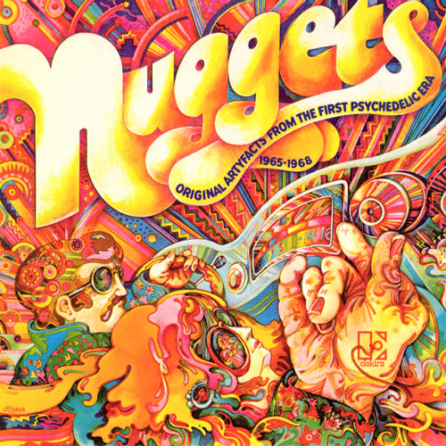
Not the greatest sleeve in the world, actually, but at least more in line with its contents than the 1976 edition:
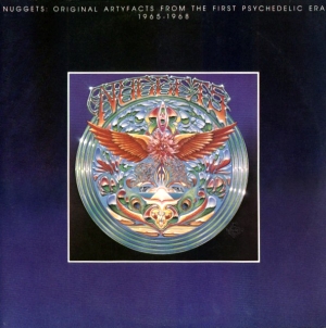
Ugh. Had it not been for the small-type “Original Artyfacts from the First Psychedelic Era: 1965-1968” subtitle at the top, I might have mistaken this for a Triumph album when I first came across it in a cutout bin as a 17-year-old in late 1979.
Detouring from the downright ugly to the merely silly, I always found the Chess Blues Masters series of double albums peculiar:
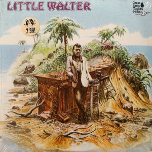
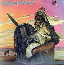
Maybe the idea was to picture these icons in blues heaven, though Little Walter looked more like he’d been shipwrecked in Hawaii. Howlin’ Wolf as a pilot (or something) in the desert was also a most incongruous setting for a master who’d thrived on Chicago’s South Side.
Now we come to the winner — or loser, depending on how you see it — in the ugly reissue LP cover sweepstakes. For me, it’s gotta be this turkey:
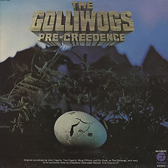
This does have both sides of all the singles the Golliwogs recorded for Fantasy between 1964 and 1967, before they changed their name to Creedence Clearwater Revival. The idea was obviously to show them as an embryo before they’d hatched, but the image didn’t so much lay a golden egg as a rotten egg.
But like a number of the records detailed in this post, it’s pretty hard to find today. All of the tracks did come out on CD, but only as part of a 2001 Creedence box (which, to be fair, did add eight previously unissued outtakes). If you want them on vinyl, it’s still a sought-after rarity — albeit one that might be missed in the used bins even by some CCR fans, considering Fantasy didn’t even bother to put a photo of the musicians on the cover.
You picked some winners! I also vote for The Move “The Best Of The Move” on A&M.
Some of those are awful, but some I don’t mind – I always kinda liked the Yardbirds at the Anderson Theater cover, but hated the mid-80’s ish comp with just type face: http://1.bp.blogspot.com/_3JckQQgTbxE/TT4NLHvSKYI/AAAAAAAACEg/zLa9kcaB6S8/s1600/The-Yardbirds-Great-Hits-326799.jpg
And then there is this kind of blasphemy – the Jim Hall/Bill Evans album Undercurrents has one of my favorite covers of all time. The latest cd reissue puts that on the back about postage stamp size, with a studio shot on the cover!
http://www.soundstagedirect.com/media/bill_evans_jim_hall_undercurrent.jpg
‘in the groove’,marvin gaye
I generally like your writings about music but am not sure you’re such an expert on art. The Yardbirds covers were an interesting use of scratchboard technique, a challenging medium, something not just any artist could slop out. And I always liked the pterodactyl cover for the Airplane. You generally dislike literalness; must it be a literal airplane?